
Inequality and the neoliberal legacy.
Half a century of trickle-up economics has decreased prosperity, overburdened the health system – and caused a vast number of premature deaths. In Australia, the Howard government did most of the damage.
Right through the 19th century, inequality rose between the various social classes in developed nations. The economic mantras of early capitalism – that governments should stay out of economic and social affairs – drove most new wealth to the upper classes.
Most employers of the time favoured the ‘Iron Law of Wages’ – the idea that workers should be paid according to supply and demand. It meant that business could keep wages low as long as there were workers who would accept subsistence wages. And without trade unions, employees had little power to bargain with business owners.
After the First World War, the balance of economic power shifted. Workers organised and began to demand better pay and conditions, governments enacted laws on minimum wages and ordinary people got the vote. From then, until the 1960s and 1970s, western societies became more and more equal. The top echelons continued to prosper but so did the rest.
But as the political and economic tides turned in the 1970s, some of the ideas of the 19th century surfaced again: the notion that entrepreneurs were the drivers of all prosperity and that governments should get out of the way of creative capitalism. Deregulation, crackdowns on union power and ‘flexibility’ in employment conditions all contributed to a sharp rise in the share of economic output accruing to the top. The rich got richer and the rest barely moved.

In Australia, figures for the past 40 years show that the income gap between the top and bottom 10% remained relatively stable until the election of the Howard government in 1996. Changes to industrial relations laws reduced the power of unions. Weakening of social programs like Medicare and welfare entitlements also eroded the money people had to spend.
Between 1981 and 2018, the inflation-adjusted gap between daily household disposable income for the top and bottom 10% increased from $52.97 to $88.34 – an increase of 67%. Almost all of that happened in the Howard era between 1996 and 2007.

Over the past two decades, there were rises in all income quintiles – but the difference between the richest 20% and everyone else became wider than it had been since before the Second World War.

Over the past two decades, there were rises in all income quintiles – but the difference between the richest 20% and everyone else became wider than it had been since before the Second World War.

This pie-chart shows how the value of economic growth was distributed:

WHAT DO PEOPLE SPEND THEIR MONEY ON?
A basic reality of economic inequality is that poorer people spend a far greater proportion of their incomes on essentials – food, accommodation, transport and so on – than the rich.
In 2021-22 the poorest quintile spent 16.4% of disposable income on food, against 5.1% for the wealthiest. For rent (which includes imputed rent for owner-occupiers) it was 11.9% against 1.9%.

Wealth and income are separate but related concepts. If income is less than expenditure, savings – that is, wealth – is reduced. That’s just what happened in the last financial year to the poorest 20% of Australian households.
When incomes are too low to cover essentials, any remaining savings are swallowed up and people go into debt. Those loans – credit cards, payday lenders – often carry extortionate interest rates. Quickly, people can fall into a financial morass.

HOW THE RICH MAKE THEIR MONEY
Much of the disparity in wealth is the result of differing sources of income at various social levels. Lower-income households derive almost all their income from wages, with some contribution from government and charitable benefits. People in higher-paying jobs, such as company executives, have enjoyed much faster pay rises than the average.
But a bigger issue is share ownership: richer people have the money to invest in shares. The past decade, which has included the Global Financial Crisis and the pandemic recession, have been unusually difficult for shareholders. Even so, share market returns (share price plus reinvested dividends) have been almost double those of wage increases.

Lower-income people usually have some share ownership through their superannuation funds. But two-thirds of all share market returns go to the richest 20%.

A similar pattern can be found in the wealth tied up in residential real estate. The distribution here is less dramatic – home ownership is more widely distributed than share ownership – but the richest 20% own 41% of residential property by value.

POVERTY
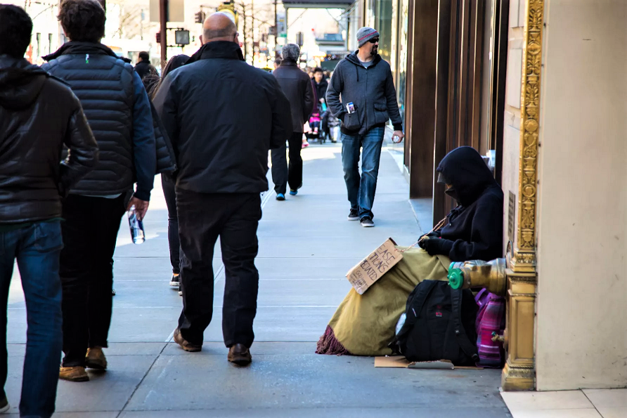
Poverty is the pointy end of inequality. According to the World Bank, Australia is the 18th richest country in the world, measured by GDP per capita. But more people in Australia are living in poverty than in most of the countries with which we commonly compare ourselves.

MEASURING THE RICH
One measure of high-end prosperity is whether the number of millionaires has increased or decreased. Between 2015 and 2020, the number of Australian individuals with assets over US$1 million increased by 65%. Inflation had something to do with this but not much: this was a period of generally very low inflation throughout the world. Increases in property value and shareholding returns were responsible for most of it.

The annual Global Wealth Report compiled by Credit Suisse notes that “2020 marks the year when, for the first time, more than 1% of all global adults are dollar millionaires”. In Australia, that figure was 9.4%:

The same report predicts that by 2025, Australia will have 1.27 million more millionaires than it did in 2020. That would be a further rise of 70%.
It’s a similar pattern with the ultra-rich. Australia has far fewer individuals with over US$50 million than the United States, but the rate at which ours are increasing surpasses America.

LIFE, DEATH AND INEQUALITY
How healthy you are and how long you live depend heavily on how rich you are. Chronic disease and premature death are far more common among the lowest socio-economic groups than among the highest.
These tables show the areas with the highest and lowest life expectancy figures. People born into wealthy districts – Sydney’s north shore and eastern suburbs, and the expensive inner suburbs of Sydney, Melbourne and Brisbane, can expect to live five or ten years longer than those in working-class areas and in the outback.

These figures are also affected by the disparity in life expectancy between low-income indigenous people and the mostly-white higher-income inhabitants of the inner cities.

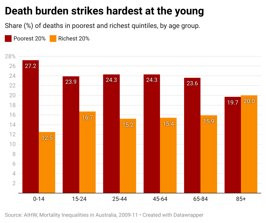
Even these figures underestimate the unevenness of the burden of death. Because poorer people are so much likelier to die young – and sometimes very young – many more years of life are lost among the poor. The relationship between wealth and life is consistent and stark.

Because low income equates with early death, it’s the young poor who are most penalised. There are, fortunately, relatively few deaths among Australian children: around 1,500 a year. But children born into a family in the lowest quintile are more than twice as likely to die before their 15th birthday as a child in the top quintile.
This relationship continues throughout all age groups except for the over-85s. Even the rich have to die some time.
The death statistics, though, ignore the levels of disease and disability that must be lived with. There are several measures of this – the burden of disease – but all tell the same familiar story.
The relationship between the rates of various forms of chronic illness and disability are consistent and predictable by looking at income and wealth. Women tend to live longer than men, but they are more likely to be living with chronic illnesses.

As the gaps in wealth and health between rich and poor have increased, the long-standing rate of improvement in average life expectancy has slowed. Improvement has continued among the rich but, among the poor it has all but disappeared.
A recent study from Melbourne University examined the statistics on premature death in Australia between 2006 and 2016. The researchers concluded:
- Mortality decline in Australia among people aged between 35 and 74 years has slowed substantially in recent years.
- Among the poorest 20%, death rates stagnated from 2011 to 2016 and the gap between the top and bottom quintiles widened further.
- Mortality rates outside major cities also showed no improvement after 2011. And inequalities increased between the regions and the major cities.
- Unless high death rates in the poorest groups are meaningfully addressed, Australia’s future life expectancy will be obstructed.